Resin Repository
Brand & Graphic Design
The esty store Resin Repository asked me to create a branding package(including logo, colour palette, font, watermark and signature) for their shop opening and a design for a Thank You Card. As the shop was organising its launch, this gave me flexibility with the designs, but I also wanted to make use of it having flexibility for the future. Their goals were to attract customers and have a high amount of sales.

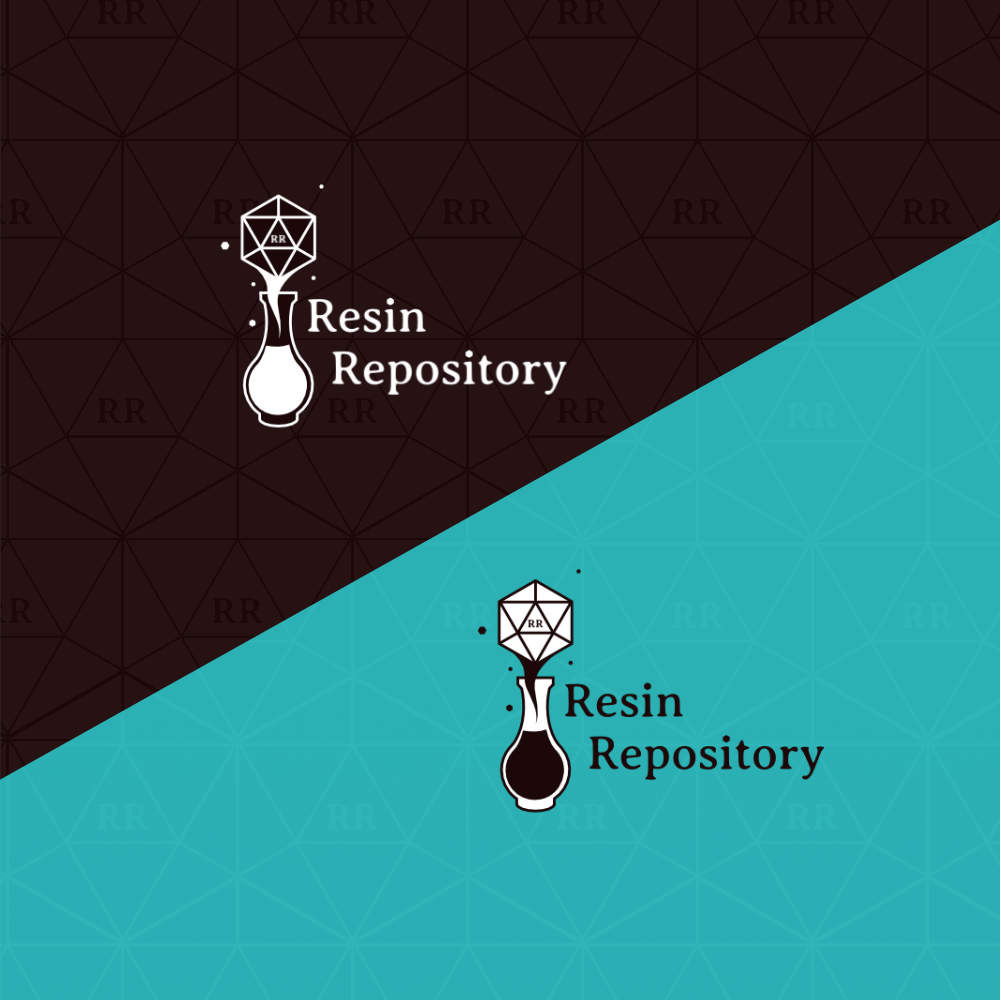
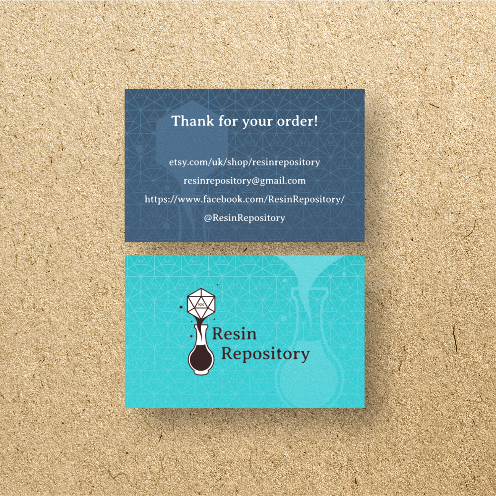
The solution for the theme of the branding was to focus on their products, which were reisn fantasy-themed jewellery and dice sets—so concentrated mainly on D20 dice, scrolls and potions. After mind-mapping some ideas, I created several logo concept sketches for the client to choose from and then discussed how to develop the desired concept further. For the font, I looked at Serif fonts to help give the brand a fantasy feel for the primary font. For the choice of colour palettes, I focused on a range of pastel colours for the fantasy angle and a nearly black to give the option of a more mature feel. Once we settled on the branding, I started designing the Thank You Card theming around the D20 to create an exciting background that doesn't outshine the content.
Working with Resin Repository to create their branding was relatively straightforward, with the regular meeting to discuss the next steps of the process. I made sure that for each session, the design was ready for the next set of decisions (e.g. logo concepts, colour options and fonts)for them to make; to move the process along. Figuring out where best to place the company name on the logo was a little finicky, but I gave them a couple of options, and they found the one they liked.
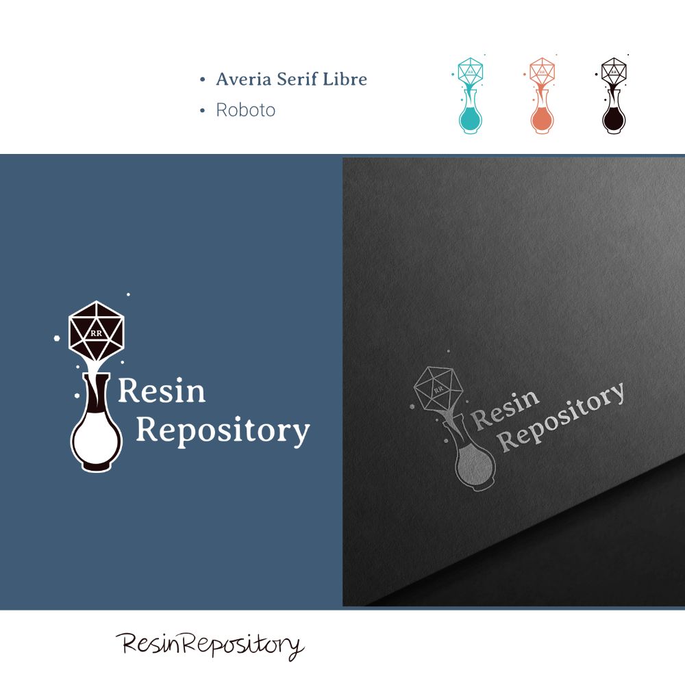
The result was a simple style magic potion and a giant D20 and mini versions floating around in an off-black, with a shade of teal as the second primary colour of the palette with a dark blue and salmon hue. We decided on Averia Serif Libre for headings and Roboto for body text for the font choices. I switched the colour to white for a dark-coloured background version of the logo. The watermark was the logo, but I lowered the opacity. I experimented with a couple of arrangements for the signature, all hand-drawn on my tablet, giving it a personal touch.
The shop did fantastically in its open week and its first year. As the products flew off the shelves, they couldn't make them fast enough to keep up! The dice set rarely lasted a day after restocking. They also received many custom orders throughout the year. Resin Repository also used the logo files to get custom stickers made holographic stickers for their packaging, which was fantastic!